



Social media is aflutter with the vote for the new eurozone banknote design, which was announced last week.
ADVERTISEMENT


ADVERTISEMENT
Netizens are fiercely debating which of the 10 finalists is their favourite, and the discourse has inevitably put the original notes back in the limelight.
While you’ve no doubt seen the designs while handling cash over the years, there’s a good chance you’ve never stopped to actually look at them properly.
Unlike euro coins, which have different designs on the front depending on which country produced them, the euro notes are identical across the bloc.
Every note has a window or doorway on the front, which is meant to “symbolise the European spirit of openness and cooperation”, while the backs have bridges, which “symbolise communication between the people of Europe and between Europe and the rest of the world”, according to the European Central Bank (ECB).
The banknotes were meant to depict architectural styles from periods in history – for example, the €10 note is Romanesque – rather than actual monuments or bridges.
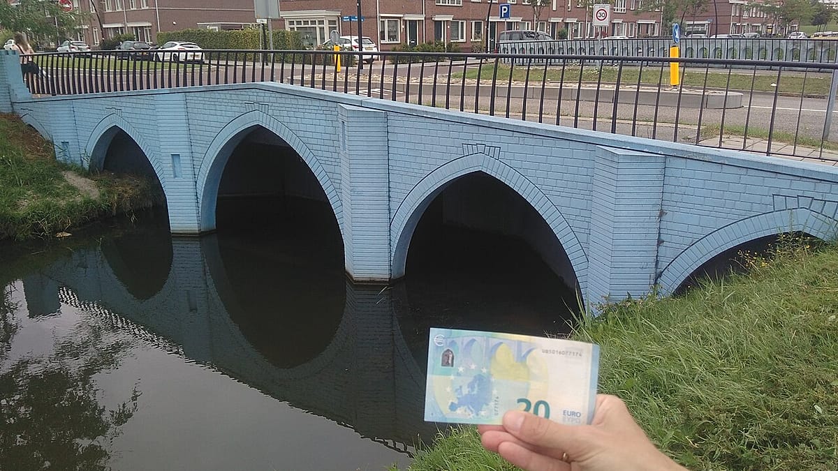
That was until the town of Spijkenisse in the Netherlands decided to make the latter a reality.
The Euro Banknote Bridges
Dutch designer Robin Stam came up with the idea to create the real-life bridges in 2011, working with a local council to realise the project at a new housing project, reported Dezeen.
The seven bridges opened to the public between 2011 and 2013, and they are all within walking distance of each other in Spijkenisse.
Spijkenisse is easily reached on the Rotterdam metro’s C and D lines.